Pages

Sunday, January 27, 2013

Cyclamen

Cyclamen2, watercolor sketch on Langton cp, 18 x 14 cm

Cyclamen1, watercolor sketch on Arches cp, 17 x 14 cm
Two small sketches of the adorable potted flowers I got for my birthday. I love Cyclamen, and this particular one resembles more the wild variety, than the larger and more formal cultivated plants. I also took the opportunity to try the "Opera rose" W&N shade, which admittedly cannot be produced by any of my DaVinci colors.

Friday, January 25, 2013

Roses for the ladies

Cream Roses, watercolor on arches cp, 42 x 56 cm (16" x  22")
Happy Birthday to my sister-in-law, and... to her sister-in-law!

Monday, January 21, 2013

Antalya's old harbor

Antalya's Old Harbor, watercolor on arches cp, 55 x 30 cm
I have been planning to paint this view for a while now, but I was a little scared by the complexity of all these houses and boats. I had to find a way to simplify them to textures, suggesting the actual objects. After doing a small size study, I had a more clear idea how to go about it. I also used a limited palette of only three colors - prussian blue, indian yellow and quinacridone red. This simplified things, but made it a bit harder to get the dark mixes. Overall, I think that it gives an idea of what a picturesque place this is, with the old Roman port and the Turkish blue waters. (Although, as my husband jokes, I used the wrong "nationality" of blue to depict them.)

Saturday, January 12, 2013

Turkish lamps

Lamps, watercolor on Arches cp paper, 21 x 27 cm
Lamps2, watercolor on Langton cp paper, 23 x 26 cm
Last spring in Turkey I took tons of photographs of the lamp stores in the market. These rounded shapes of stained glass and the colorful light produced from them, seemed enchanting to me. I've been keeping several of these photos on my desk, not knowing how to approach them in painting. It was time to try.

Photo of the display at a lamp store in Turkey

Wednesday, January 9, 2013

Traffic in the rain

Traffic in the rain, watercolor, 27 x 21 cm
Still on the subject of light in the dark. This was my third, and best so far, attempt of a similar scene. There are still things I wish I had done differently. But I have so little time and energy for painting this week, I think I'll leave it at that.

Thursday, January 3, 2013

Last year's "To do" list


In the beginning of last year I made a check list of things related to painting, which I wanted to learn or improve. And as everyone who makes check lists knows, the real pleasure is when you get to check items off. So here is that list again 

1.      do more portraits and figures
I counted about 30 paintings of people for the past year. And most importantly, I am not intimidated by the word "portrait" any more! I know there is much to learn and improve, but I enjoy the process.


2.      start painting larger sizes – half sheet (maybe full sheet)
My progress is more gradual here. I did several half-sheet paintings. But I am glad that I have done about 30 pieces of 30 x 40 cm size (a little larger than a quarter sheet, so that they fit in the Ikea frames). This has become my usual paper size and I have started to feel very comfortable with it. Maybe more half-sheets this year...

3.      paint more from life and en plain air and overcome the fear of by-standers
Not much to report here, apart from some sketching here and there. And when I think of all the times I carried my materials with me in vain... I also need to get into the habit of sketching more often and various subjects. 

4.      paint faster, loosen up my style and focus on simplifying the subjects
This is a process, which I don't think can ever be complete. I feel I've made some progress, but I have such a long way to go. So, simplify!

And a few new ones:

5.    master the courage to try the water-soluble oil paints I bought last year

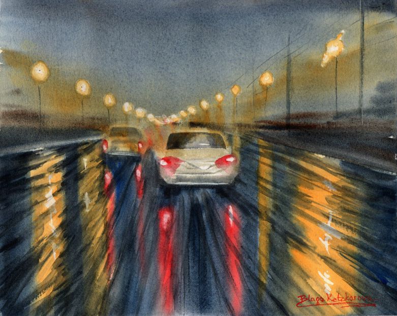
6.    improve my handling of dark colors
My recent Tango series revealed my problem with thick dark colors. I easily turn them into a muddy mess. So I need to practice more with darks and opaques. And, I am going to start now!

 Below is one of a number of simple studies of a lamp with a very dark background, trying different papers. Conclusion - to achieve acceptable coat of dark color, it must be applied onto wet paper. Also, the color mix must be quite thick, but not too dry, and the brush needs to be loaded. The Arches CP stayed wet longer and had better results than a couple of other papers I tried.

Light, watercolor study on Arches cp, 20 x 23 cm
 Inspired by the beauty of the light-dark contrast, I decided to paint this cozy scene from the kitchen.
Doing the dishes, watercolor on Arches cp, 21 x 27 cm